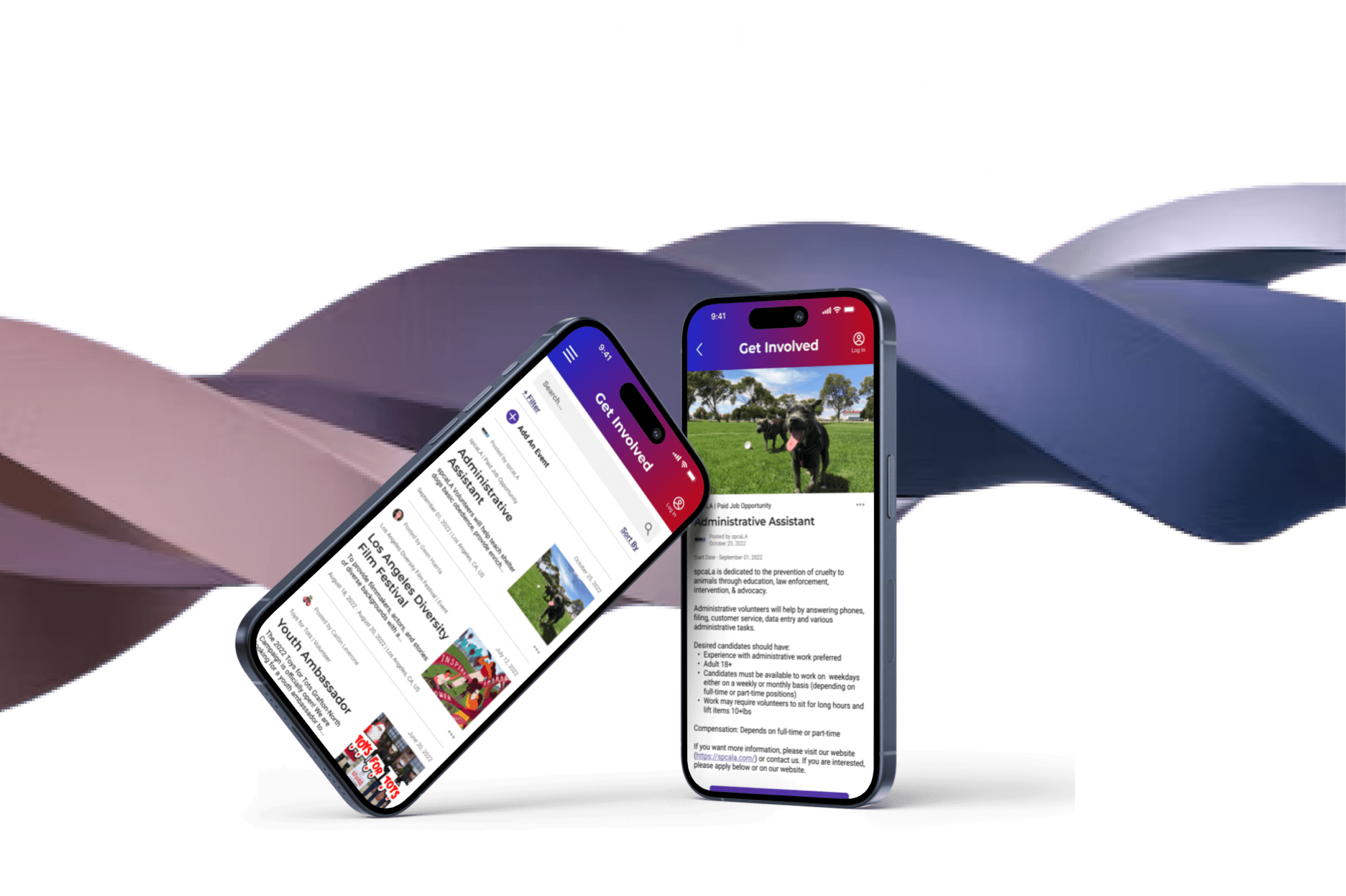
PROJECT OVERVIEW
Make us an app!
Our National Conversation (ONC) is a non-partisan media platform committed to fostering open-minded discussions and showcasing diverse viewpoints in a landscape often dominated by agenda-driven news.
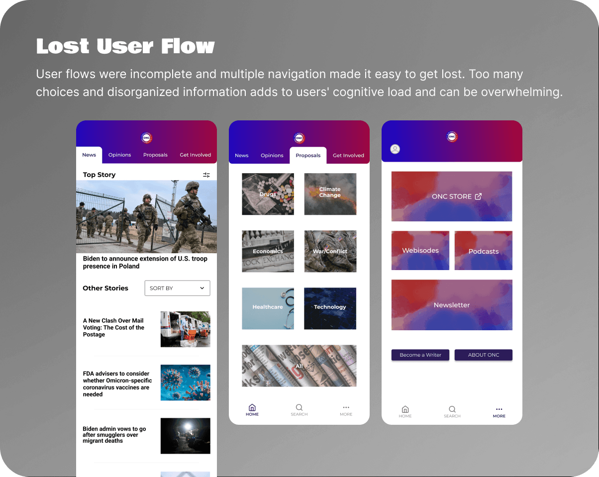
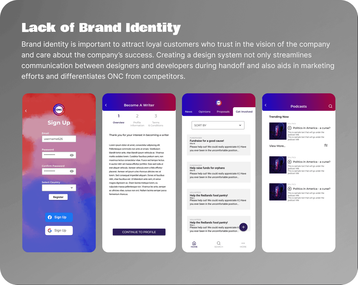
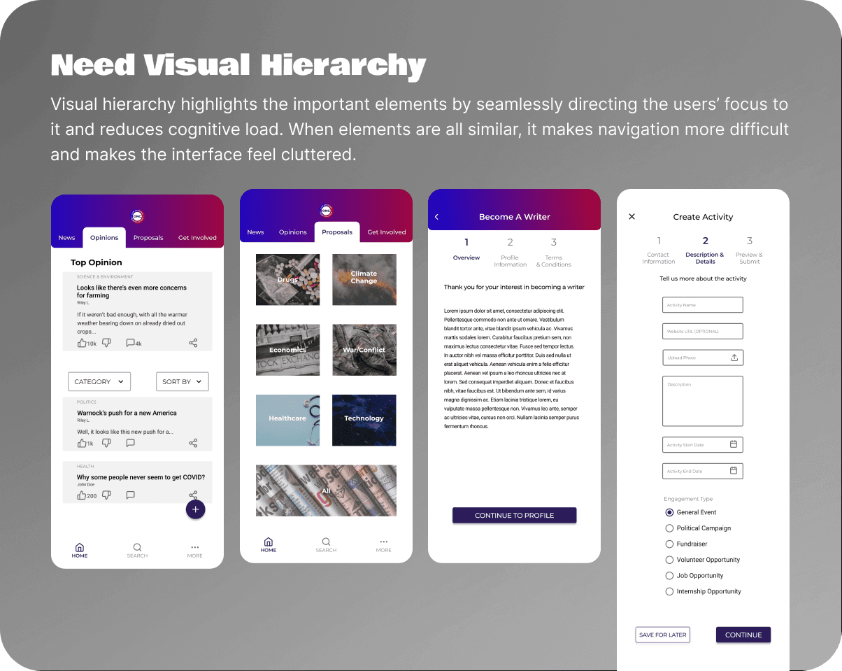
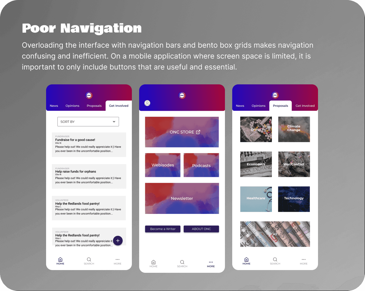
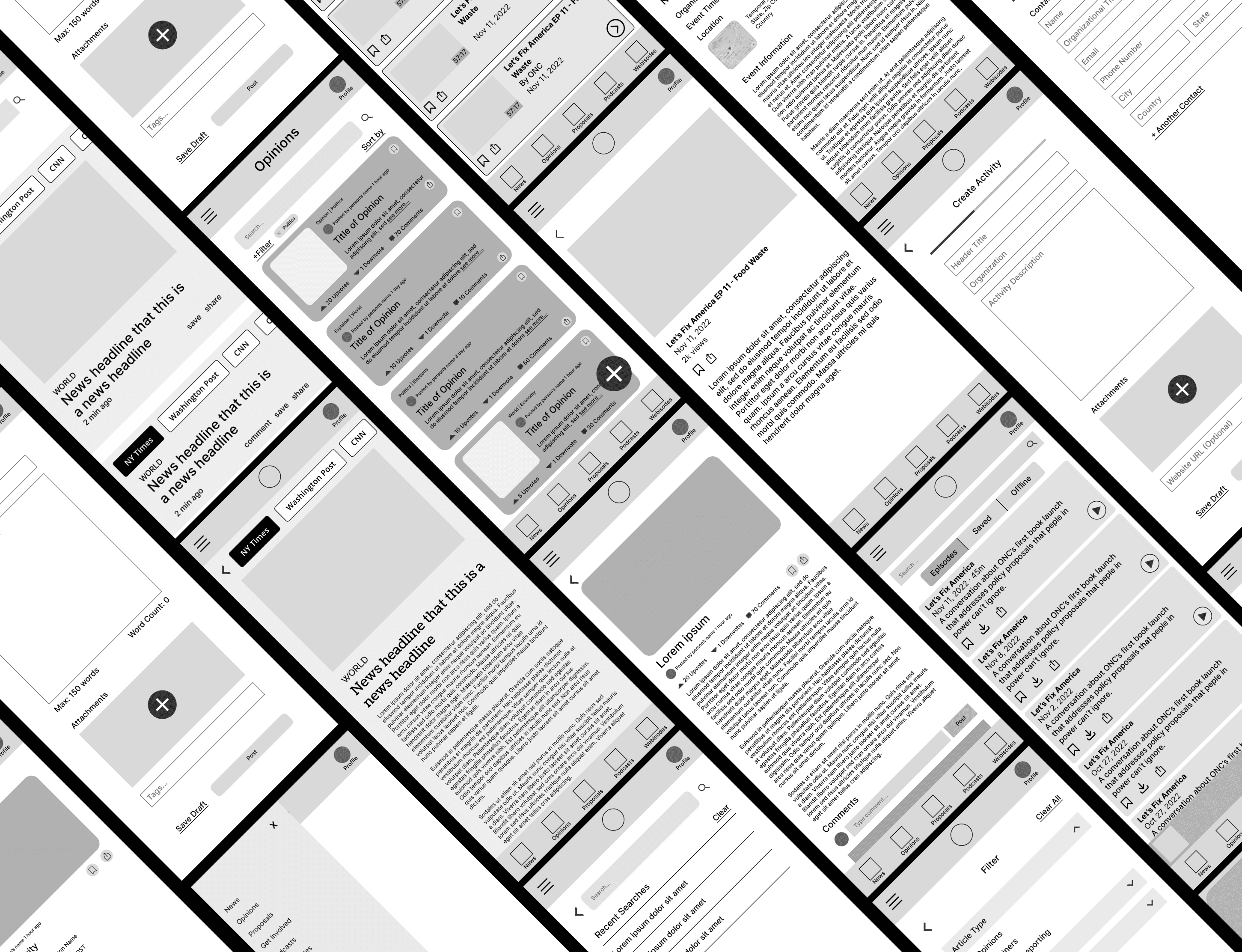
During my internship, I was tasked with finishing the mobile app wireframes left by previous interns. Upon reviewing the wireframes, I discovered no research or planning had been conducted prior to wireframing. I decided to propose a complete redesign because neglecting design thinking could lead to significant long-term consequences for the company.
After presenting my case to the team lead, I was given full leadership of the project. Over the next month, I led a team with 3 other UX/UI design interns to develop a new mobile app grounded in design thinking and research to deliver a user experience that truly addresses users' needs and company goals.
Team
Brian
Jillian
Jessica
Role
Project Lead
UX/UI Designer
Timeline
3 Weeks
Tools
Figma
Trello
Google Workspace
Problem Breakdown
Solution
Research & redesign!
Planning and strategy are essential for creating an impactful product, so I divided the design thinking process into two phases:
Research and Discovery
Identify user needs and challenges to address real problems and create a user-centered solution
Analyze competitors and market trends to find opportunities for differentiation
Validate assumptions and decisions to minimize risks and base product on real user data
Design and Prototyping
Apply insights to create effective design solutions
Refine concepts based on feedback to enhance user needs and functionality
Use prototype to clearly communicate design ideas to stakeholders and team members
Although usability testing was initially planned, an unexpected change in the timeline required us to be adaptable to ensure the successful completion of the project. To refine our designs, we utilized internal feedback and design heuristics instead.
Define
Who are our users?
At the start of this project, ONC was still in the early stages of product development, so we faced the challenge of having no user metrics or meaningful data.
To address this, we conducted research with a survey for its cost-effectiveness and flexibility, incorporating both quantitative and qualitative questions for a deeper understanding. Within 2 days, we gathered a total of 24 responses.
As a news app, we expected to reach a diverse audience, striving for inclusivity. However, the survey results revealed that most respondents were between the 18-30 years old, indicating they are in their college and career stages of life.
Empathize
What do users need?
From our affinity mapping, we identified four primary needs:
Design Solutions
Simple and Usable Design — Sleek and visually appealing interfaces that streamlines tasks such as intuitive navigation and quick access to key functions
Tailored Content — Recommend articles based on their personal preferences and needs
News Aggregation — Convenient cross-referencing and choose preferred news sources to reduce bias
Sharing Features — Easily share the article to others through a variety of options
Competitors
What's our super power?
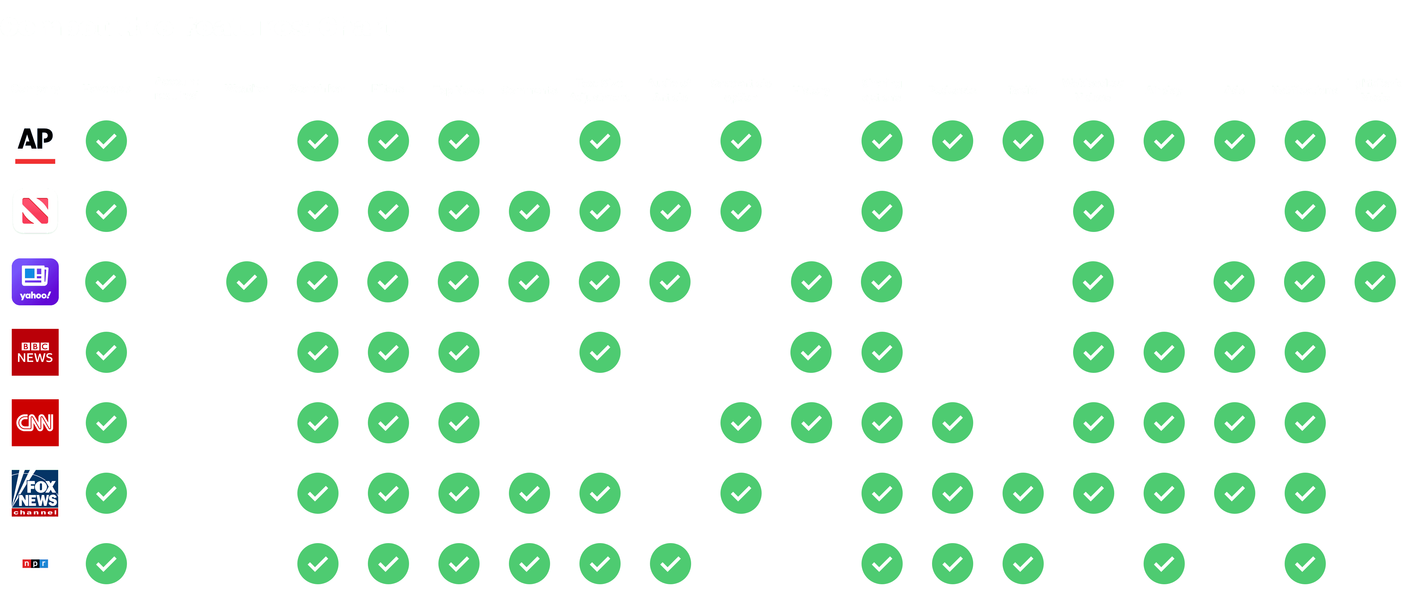
To identify what sets ONC apart, we assessed 7 established competitors through a comprehensive features audit to uncover common elements in industry apps and highlight ONC's unique value proposition. Our research revealed that, as of 2022, ONC is the only non-partisan aggregate news source, distinguishing itself with its curated news collection from multiple sources.
Site Map & User Flows
Easy breezy navigation
In my previous experiences, I primarily worked with a single user flow. However, this project marked my first time designing a complex product with multiple flows and features. To ensure seamless navigation and streamline our design process, I developed a site map and distributed the creation of user flows to my team.
Sketches & Wireframes
Rapid fire ideas
To kick off the design phase, I led a design studio where we rapidly sketched ideas and gave constructive design critiques.
During this phase, we realized that the Thanksgiving break had unexpectedly shortened our project timeline. I quickly adapted by assigning different features and splitting sketching and wireframing tasks among team members, which accelerated the design process and ensured timely completion of the project.
Design Considerations
Aggregate news — core feature for the home news feed
Users vs. guest accounts — options for personalized experience
Writers — management of writer contributions
Search — search, filter and sort options for finding content
Web vs. mobile — priorities for different platforms
Design System
A major part of the project I wanted to work on was the design system, as it ensures consistency across platforms, simplifies navigation, and builds user trust and familiarity, ultimately enhancing satisfaction and long-term loyalty. We primarily used existing design elements from ONC's website that was in development as our reference.
Colors
Although we planned to keep the original dark purple as the primary color for consistency with the website, it blended too closely with the text, impairing visual hierarchy and giving the app an outdated look. Dark, muted colors can suggest stagnation and reduce the perceived relevance of a website or application, contrasting with modern design trends that favor vibrant, energetic hues. To resolve this, we switched to a more vibrant purple to enhance contrast and create a fresher, more dynamic feel, while ensuring the color met WCAG accessibility standards.
Typography
As I advance my understanding of typography, I conducted independent research by reading articles and exploring various typefaces for this project. I chose sans-serif fonts for their high readability and subtle charm. By selecting free typefaces, I ensured that the design remains practical and straightforward for the company to implement.
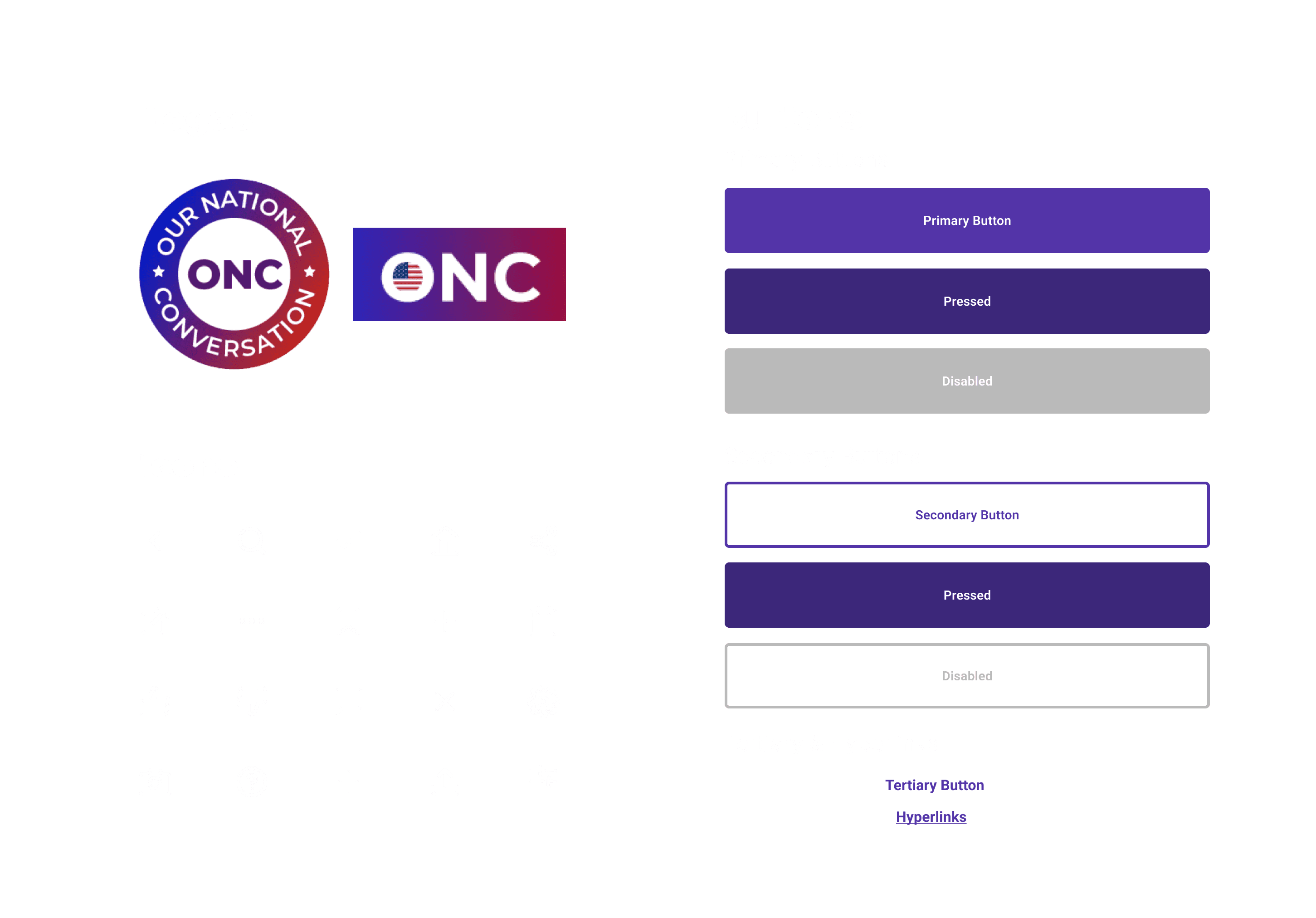
Logos, Buttons & Icons
The graphics design team had already created the logos, including the badge and wordmark, which we integrated into the app design. To maintain consistency, we matched the icons and buttons with those used in ONC's website, which was still in development.
Prototype
Putting it all together
Based on the information gathered from our research, we combined the best ideas we had brainstormed and designed a prototype to hand-off to the next UX/UI design interns and developers.
Loading, Log In & Onboarding
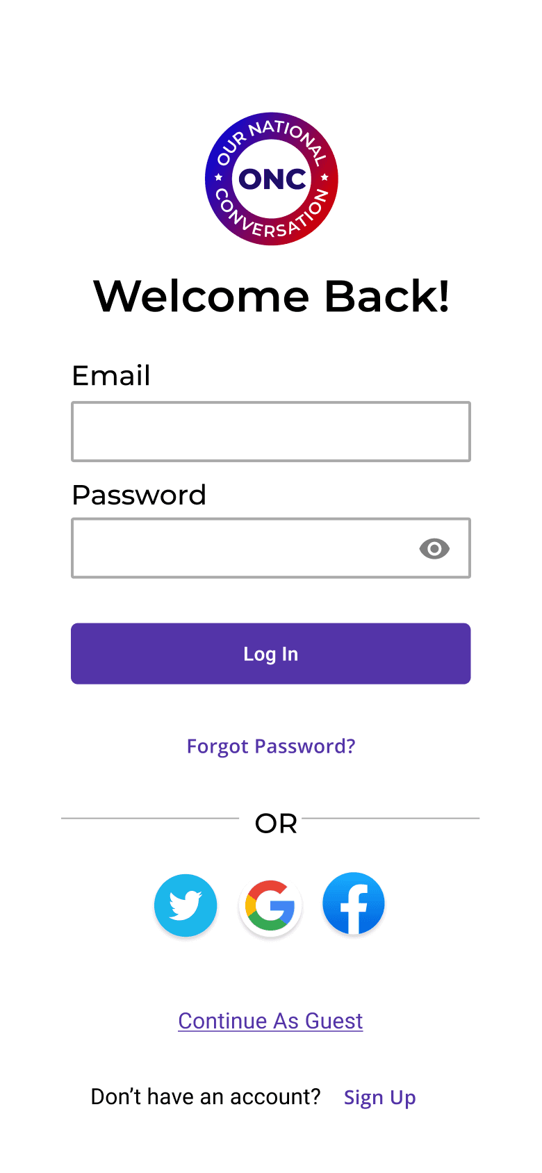
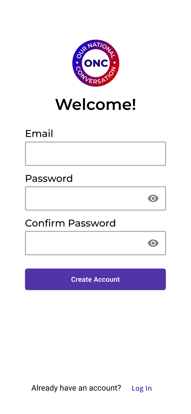
The first screens on the app are the animated loading screen, log in, and sign up screens.
Loading
Log In

Sign Up

News
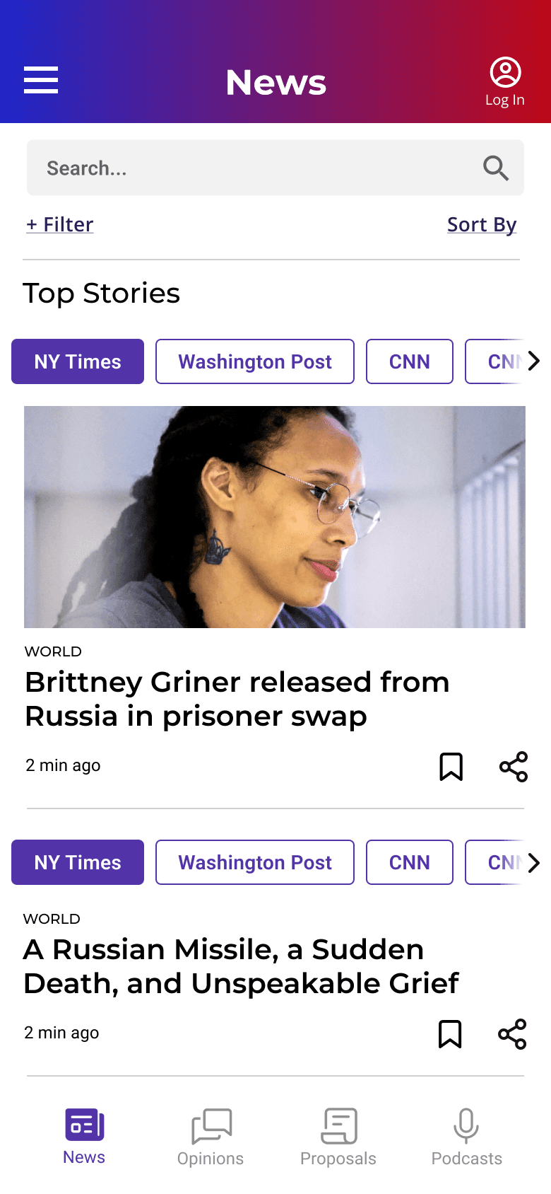
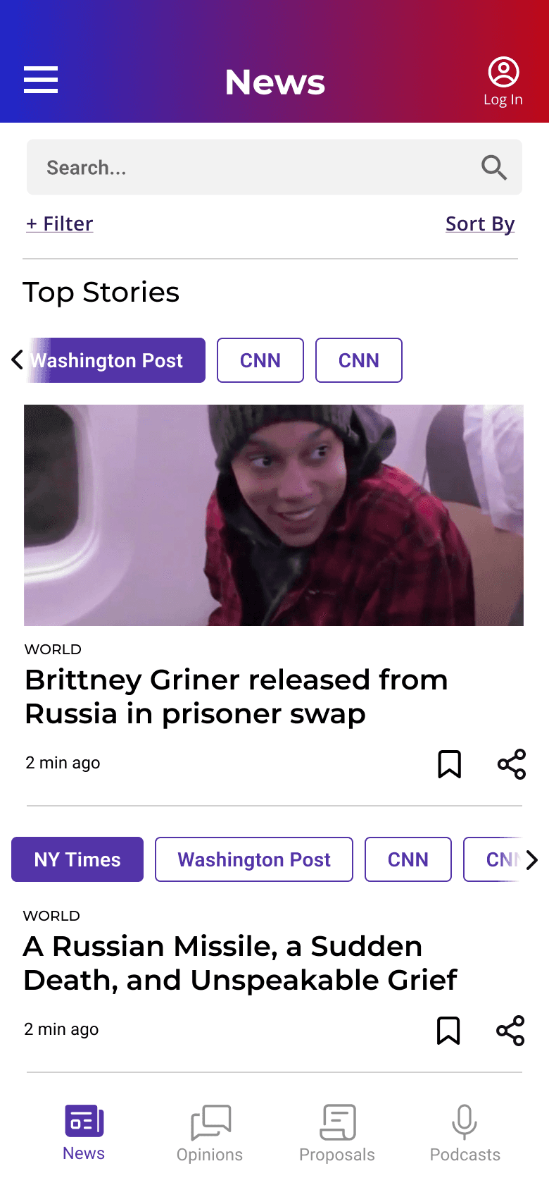
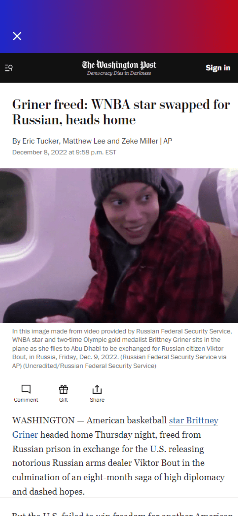
After logging in, users will find the latest news and aggregate news feature.



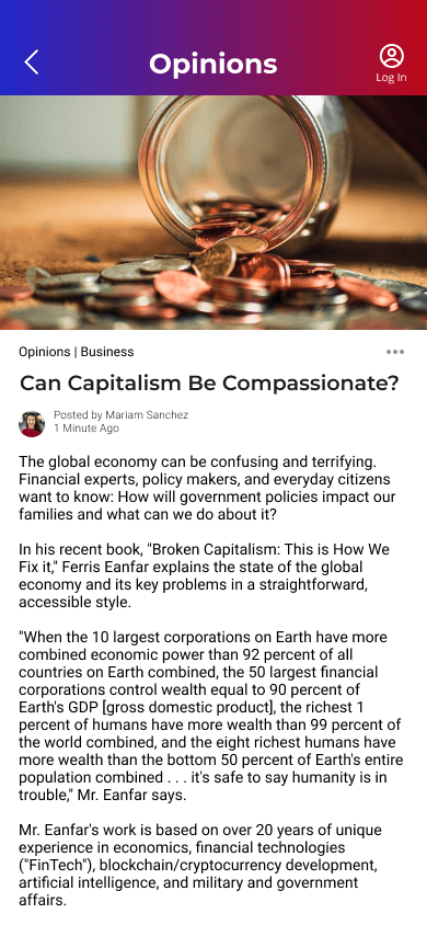
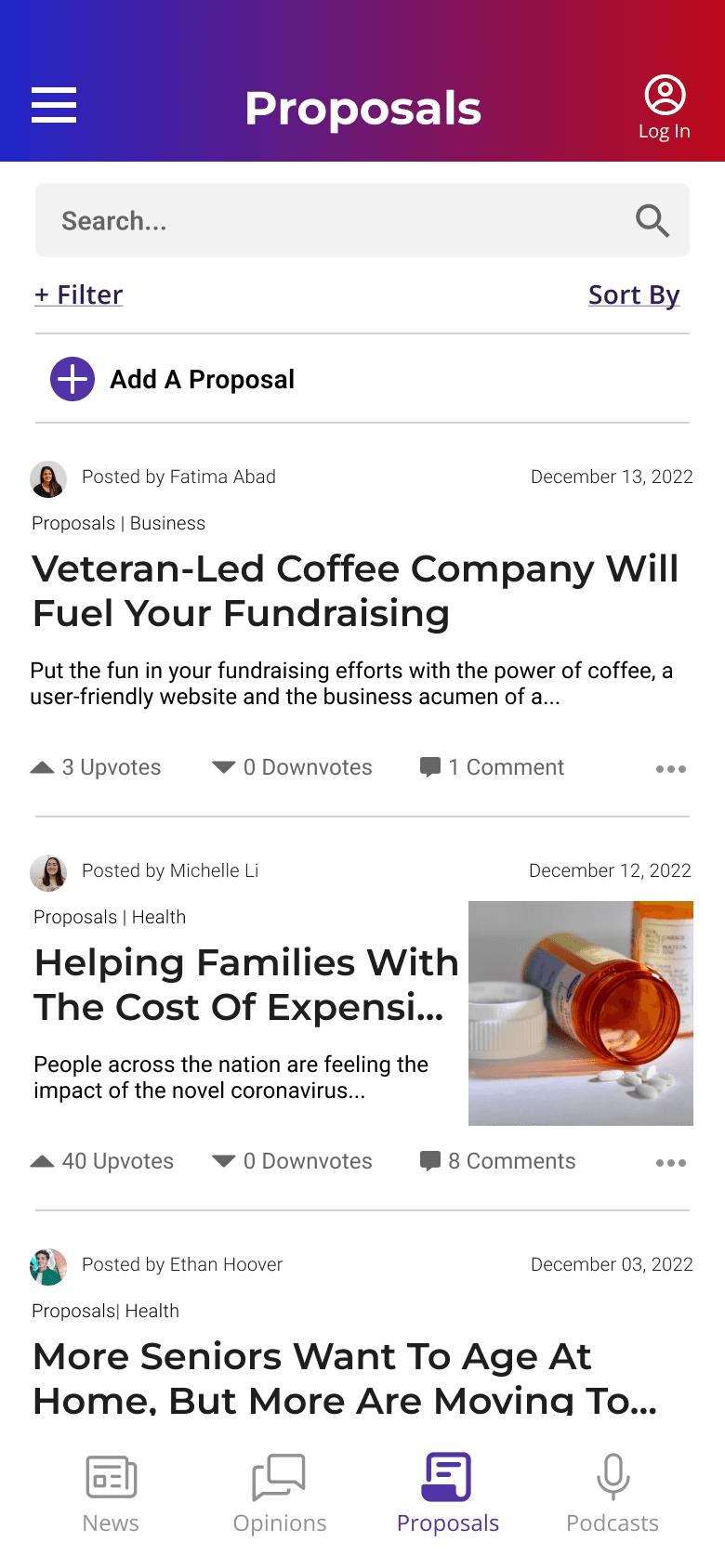
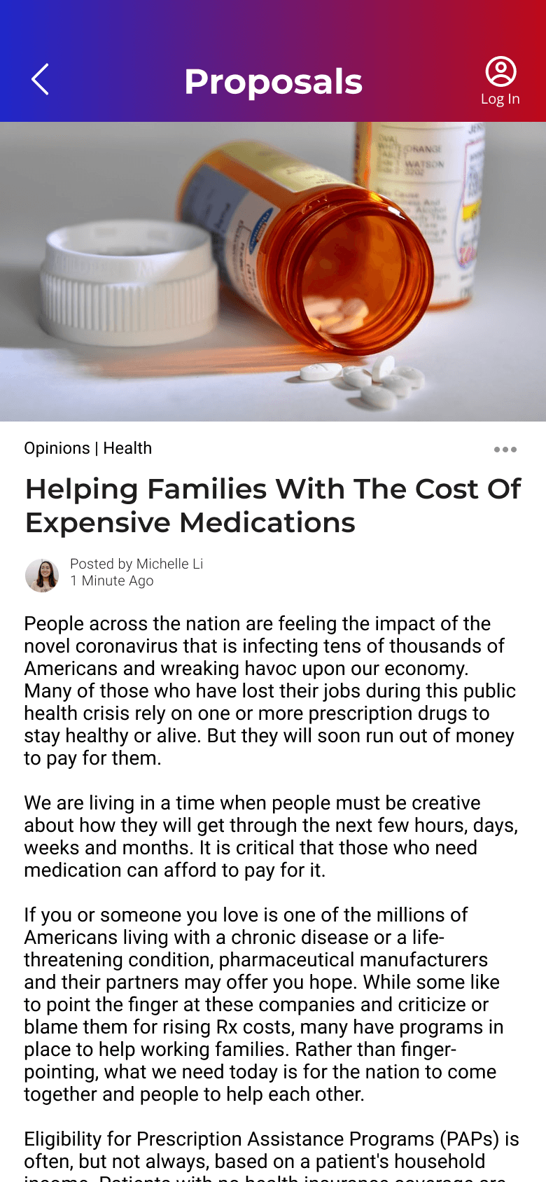
Opinions/Proposals
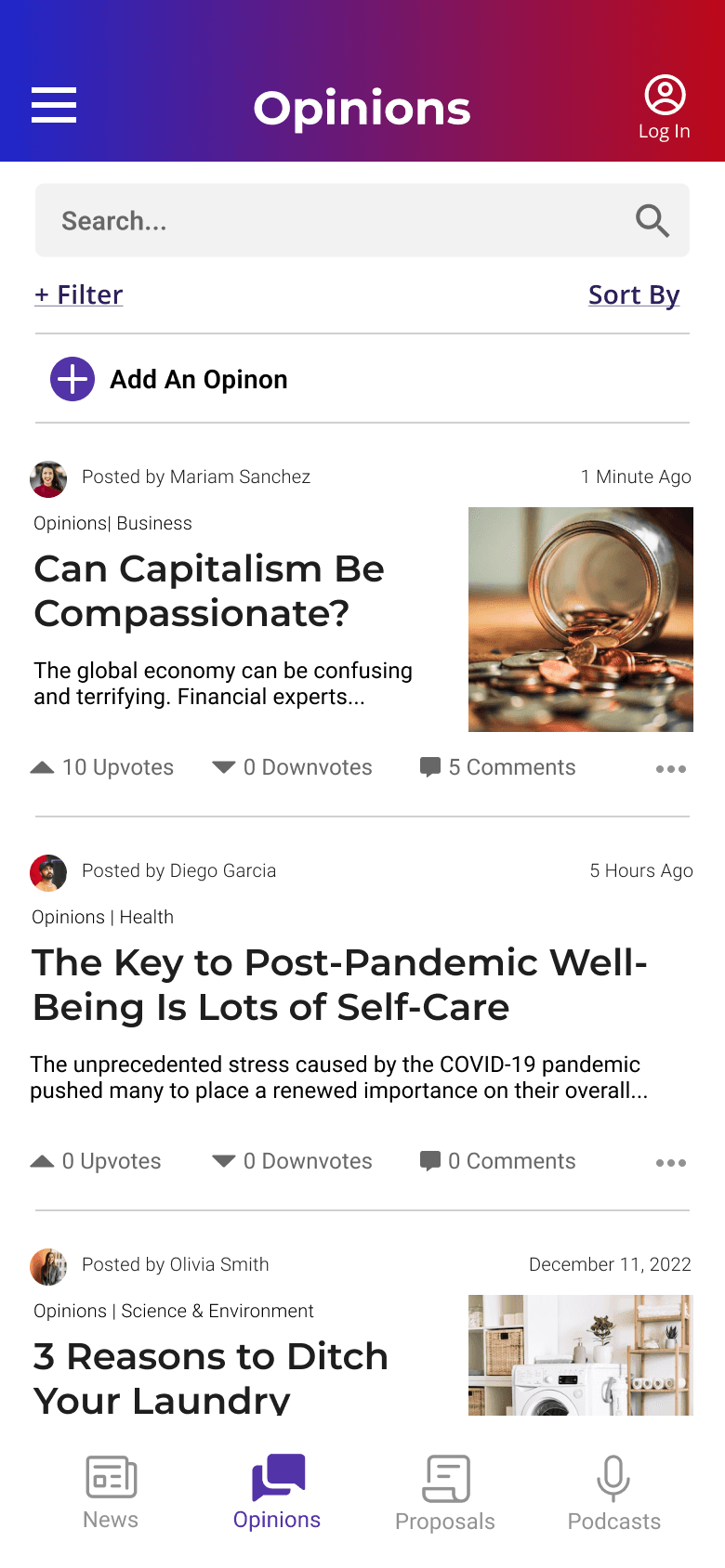
Library of articles or proposals written by approved ONC writers to foster conversations and discussions in community.
I challenged the team to design with the prevention of online harassment and bullying in mind before the UX/UI design team lead responded that we would be using a third-party app to manage and monitor comments.




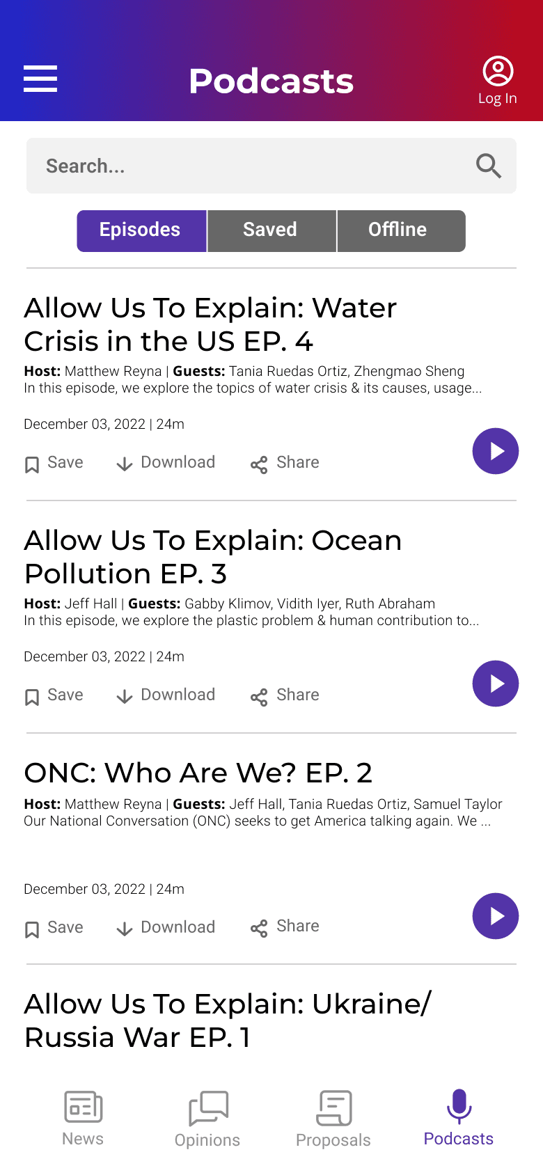
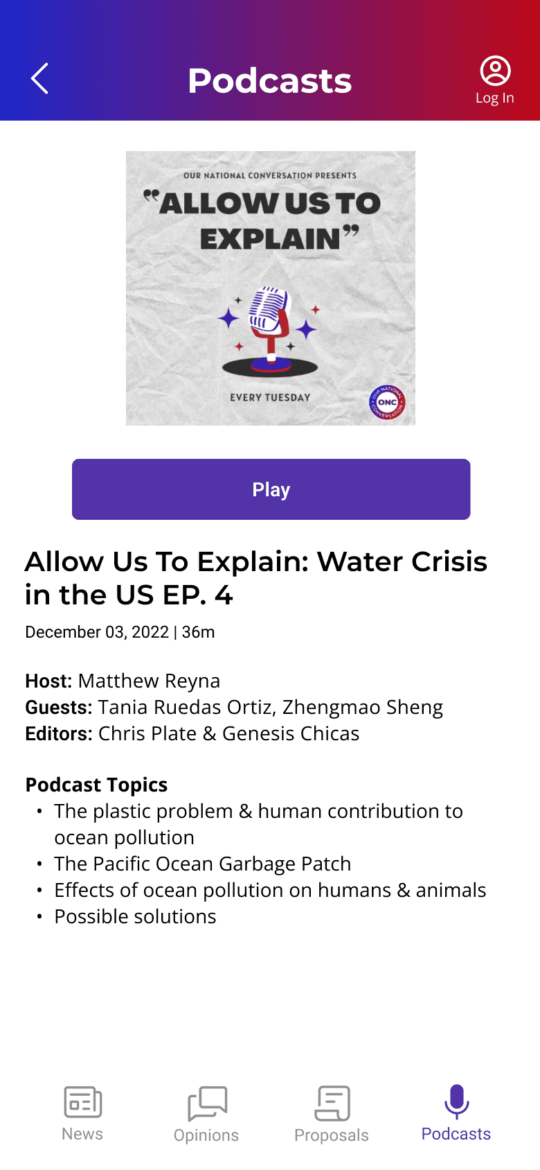
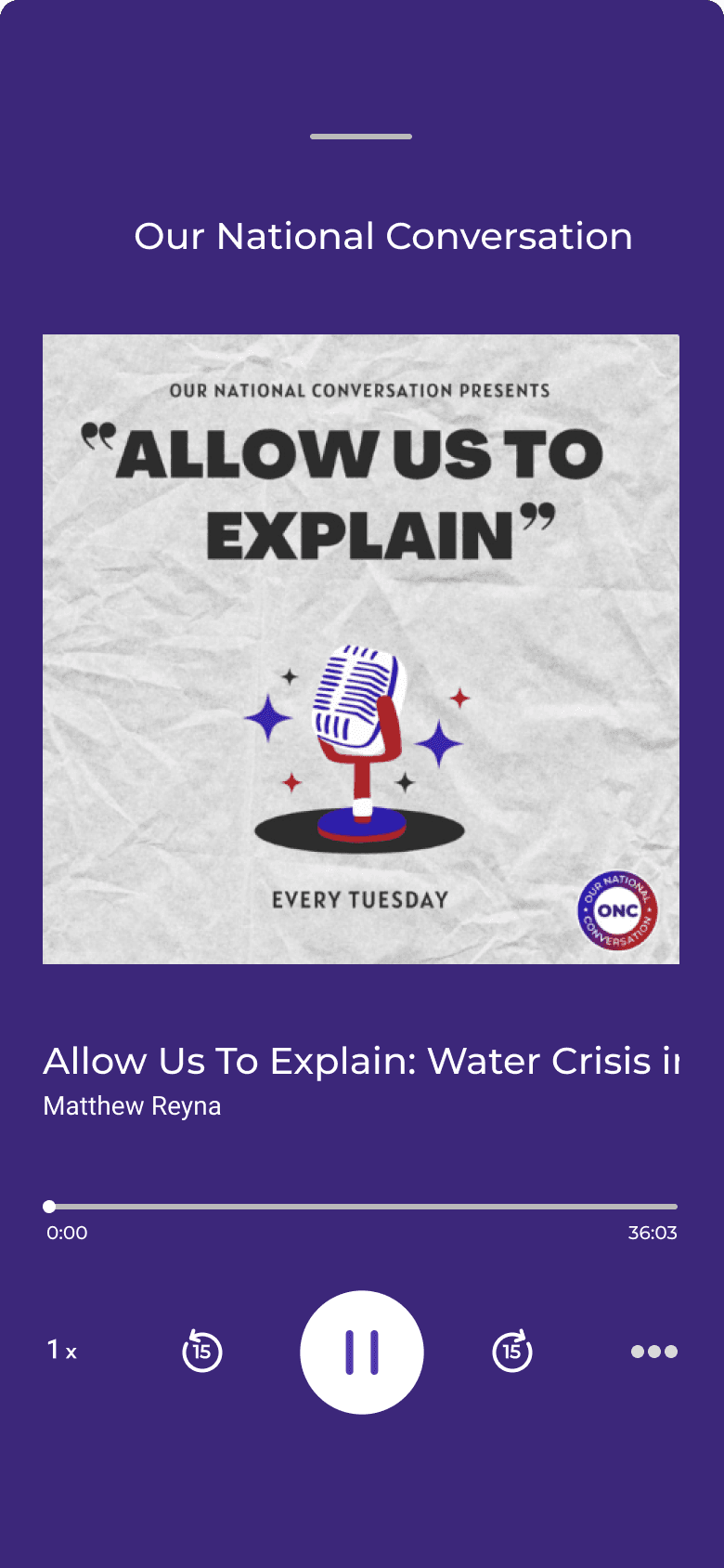
Podcasts
Full list of podcasts hosted by the ONC media team featuring guest speakers.



Final Thoughts
Achievements
Prototyped a dual B2C and B2B app with 40+ screens in 2 months
Created a guide for upcoming interns and developers
Enhanced marketing efforts for the company
Successfully led a team for the first time on a UX/UI design project
Adapted and problem-solved for a constantly changing timeline
For future iterations
Expand research efforts to encompass diverse age demographics, since our project mostly reflected millennials and gen Z
Conduct usability testing on prototype and reiterate
Measure conversion and retention rates for users that create an account
Ensure responsive layout across tablet and mobile applications
Reflections
With a team predominantly composed of college students, frequent scheduling conflicts arose and despite the challenges, I gained valuable lessons to be flexible and proactive in problem-solving within time constraints
In the future, I want to put more thought into what I measure as a baseline to calculate the impact of my work at the end of a project
